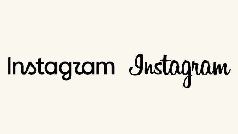
Meta-owned platform Instagram has updated its text-only wordmark logo for the first time in a decade. Announced by Instagram boss Adam Mosseri on both Instagram and Threads, the new design replaces the soft cursive script with a hybrid style blending print and script.
The new font has more curved, almost handwritten-style shapes. Some of the changes can be seen in letters such as “s,” “g,” and “r,” giving the name a different look from the one social media users have seen for years.
Instagram Gives Its Name A New Look
Showing the updated Instagram wordmark, Mosseri shared an image in black against a white background. The familiar pink-and-orange gradient logo has not been changed. Instead, the update focuses on the word “Instagram” that appears with the logo.
Mosseri said the change was meant to give the wordmark a cleaner and more modern feel while still referencing parts of its original style and maintaining simplicity.
“The wordmark at the top of the app hasn't changed in 10 years, so it was time for a refresh. Cleaner and more modern, with references to the original and the simplicity and craft that's always made it Instagram,” he wrote in the caption.
The last time Instagram updated its design was in 2016. The company moved away from the classic brown camera with the rainbow stripe to the colorful pink gradient that users still see today.
Users Questions Why?
The update is small, but it has already led to plenty of debate among users. While some reacted to Mosseri's post positively, the response soon became more critical.
Many users on X said they did not like the new font, while some joked that the logo now looks like it reads “Instagzam” because of the shape of the font used for the “r.”
“After 10 years, a little change can bring a whole new vibe! Love seeing Instagram continue to evolve while keeping the creativity alive,” read a comment.
Another said, “The font looks like a mesh of Hebrew and Arabic? I find it a little hard to read with the line breaks.”
“I think the new Instagram logo is just ugly,” an X user posted.
i think the new Instagram logo is just ugly. pic.twitter.com/z9n6ZWB8Ml
— Priyanshu Ratnakar (@0xratnakar) August 13, 2026
A person wrote, “Good grief, man. These decision-makers at Meta must have absolutely no regard for quality work. The new Instagram logo is funky in the worst way possible. It's leaning both into the classic script and also trying to drop in a standard ‘a' and ‘m' sans serif. Also, the ‘I' is a totally different weight.”
Good grief man.
— Ethan Driskill (@EthanDriskill) August 13, 2026
These decision makers at Meta and Google must have absolutely no care for quality work.
The new Instagram logo is funky in the worst way possible. It's leaning both into the classic script and also trying to drop in a standard "a" and "m" sans serif. Also the… pic.twitter.com/vSuxzLN3Ji
“Is it just me or does it read: instagzam?” questioned a user.
An individual wrote, “Does the “r” feel a bit hard to read? I understand it's written script. I do like change.”
Essential Business Intelligence, Sharp Market Insights, Practical Personal Finance Advice, Daily Fuel, Gold and Silver Prices and Latest Stories — On NDTV Profit.